
How to Make your own CSS Framework - Part 3
This article is the third part of a comprehensive guide on how to build your own CSS framework, starting from planning, designing all the way to coding. These are the things that I learnt while I built my own CSS Framework Sleek, which is completely useless.
If you haven’t seen the two previous articles, go check it out here:
How to Make your Own CSS Framework - Part 1
How to Make your Own CSS Framework - Part 2
Designing and other stuff
This is the final step before we start the coding. In this section we will mainly talk about the following things:
If you are already familiar with these things, feel free to skip ahead.
CSS Reset
Different people use different browsers, it maybe Firefox, Chrome, Safari or even Internet Explorer. We need to make sure that our style looks the same everywhere. This is where the CSS Reset comes in.
CSS Reset does exactly what it sounds like, it resets the style so that we have a uniform and a consistent style across all types of browsers and devices.
The code below shows what a CSS reset might look like. This is just a small subset. There are a lot of other components that require reset, for example tables, captions, textinput etc.
1
2
3
4
5
6
7
8
9
10
11
12
13
14
15
16
/* CSS reset */
body,div,dl,dt,dd,ul,ol,li,h1,h2,h3,h4,h5,h6,pre,form,fieldset,input,textarea,p,blockquote,th,td {
    margin:0;
    padding:0;
}
html,body {
    margin:0;
    padding:0;
}
ol,ul {
    list-style:none;
}
h1,h2,h3,h4,h5,h6 {
    font-size:100%;
    font-weight:normal;
}
We will be using Normalize CSS, which is a really small and an amazing reset. You can checkout the code for Normalize here. It is well documented and you’ll be able to clearly see what components are being reset to what values.
Media Queries
A responsive design is one which works well on any device irrespective of the screen size. Obviously, in order to make that happen, you need to write CSS which is responsive. This is what media query helps us with.
Media query allows you to write different CSS for different screen sizes.
1
2
3
4
5
6
7
8
9
10
@media only screen and (max-width: 600px) {
  body {
    background-color: blue;
  }
}
@media only screen and (min-width: 600px) {
  body {
    background-color: green;
  }
}
The above code sets the body background color as blue when the screen size is below 600px and sets it to green when the screen size is above 600px. Using media query, we can write CSS that looks perfect on all devices starting from desktops to smartphones. We will be setting breakpoints to distinguish different screen sizes and use different CSS for different breakpoints.
Bootstrap uses the following breakpoints:
1
2
3
4
5
6
7
8
9
10
11
12
13
14
/*Extra small devices (portrait phones, less than 576px)*/
/*No media query for 'xs' since this is the default in Bootstrap*/

/*Small devices (landscape phones, 576px and up)*/
@media (min-width: 576px) { ... }

/*Medium devices (tablets, 768px and up)*/
@media (min-width: 768px) { ... }

/*Large devices (desktops, 992px and up)*/
@media (min-width: 992px) { ... }

/*Extra large devices (large desktops, 1200px and up)*/
@media (min-width: 1200px) { ... }
We will be defining similar breakpoints for different devices and try to make the design more responsive.
Design System
Before you can start making your framework, you need to have a design in mind. For example, if you want to build a button, you need to determine it’s size, the margin, the padding, size of the text inside the button, border radius and so much more.
There are a lot of good design systems like Material Design or Ant Design which you can use for inspiration. Their websites have extensive guidelines about the design system.
I am not really an expert in web design or UI/UX. But it is really easy to find a lot of good design guides and references on the internet.
Tools for designing
My go to tool for designing is Figma. The main reason is that it’s an online tool and it offers upto 3 projects in free version, which is more than enough for me.
There are lots of other good tools in the market like AdobeXD, Sketch. This article gives a really good comparison of some design tools.
But always keep in mind that in the end, it’s just a design tool. What matters is what you build with it. A lot of people tend to waste time jumping from one tool to another. Just pick one which feels comfortable to use. You can always switch tools in the future if it doesn’t feel right. Most of the skills you pick up are transferable. Once you master one software, it won’t take much time to master a new one.
Typography
This is another essential element to a CSS Framework. Your font defines your CSS framework.
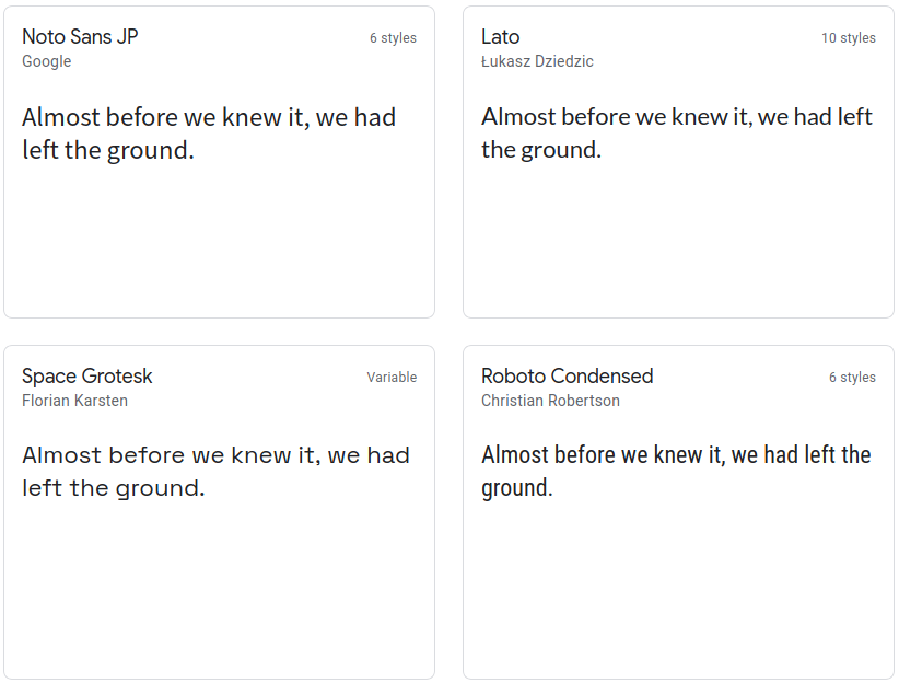
There are a plethora of font faces available for you to choose from. Picking the right font is just as important as anything else. Your font should be cohesive with the rest of your design.
While browsing the web, I found this is really good Crash Course on Fonts. This will give you a good idea about types of font available for you to use.
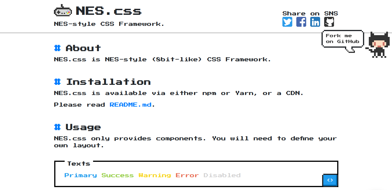
Personally, I tend to find Sans-serif Geometric Typefaces to be really attractive because they are simple and elegant. But the typeface also depends on your framework. If you are building some wacky CSS Framework like NES, you can even use Comic Sans. That’s totally upto you.
But make sure it is in harmony with the rest of your framework. It shouldn’t stand out from the rest of the design.
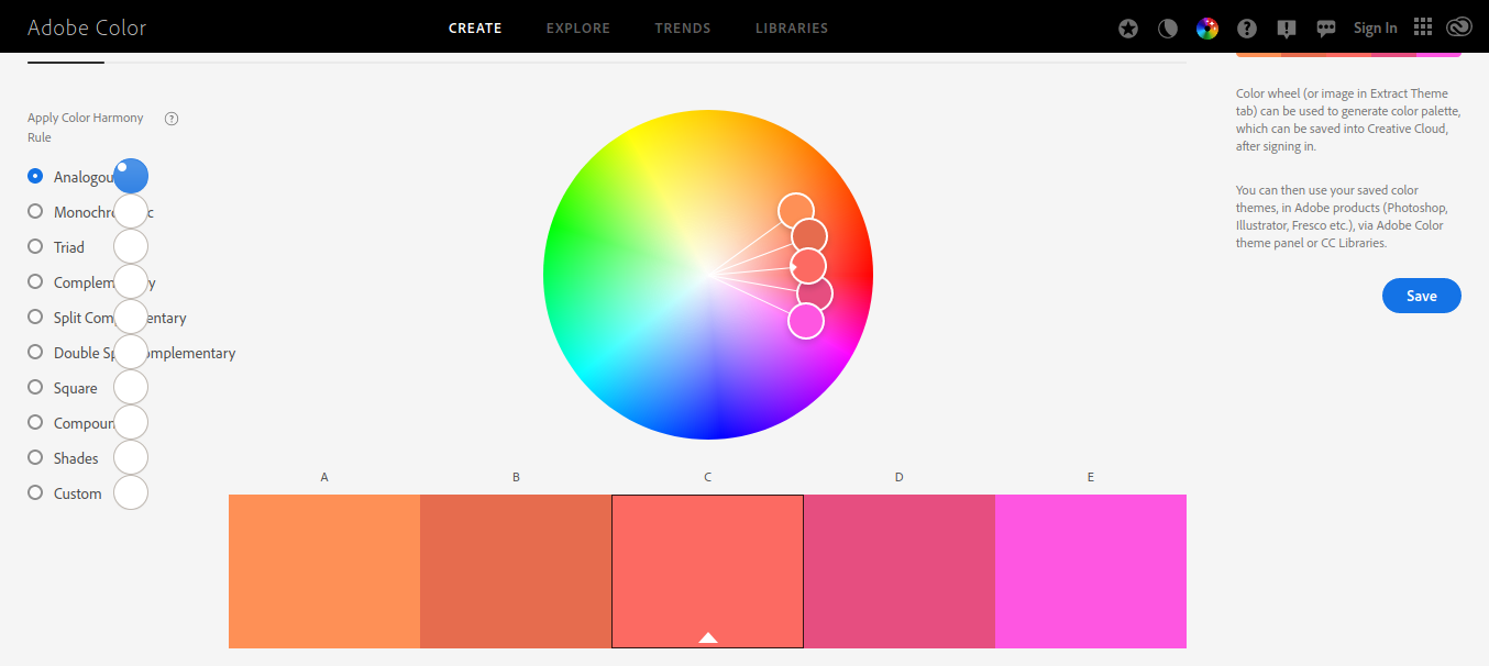
Color Scheme
There are a total of 256 x 256 x 256 combinations of color possible. It is generally preferred to pick a bunch of colors from this huge set and use it on your website.
Again this is not something that I am expert at, but there is a whole subject about colors, how to choose appealing colors and what colors look good when you combine them. There are different color schemes like monochromatic, complimentary, triads etc.
The Adobe Color is a really good online tool which gives you colors based on different schemes.
The image below shows the colors used in Bulma CSS Framework. If you have worked with different frameworks, you should know that a framework traditionally has colors like primary, success, danger etc.
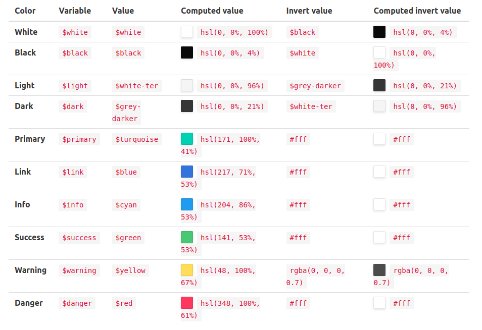
I’ve linked to various frameworks’ colors. Check them out and observe what colors they are using. Maybe you’ll find some inspiration for your own framework.
Conclusion
In this article, we briefly went through some of the basic things involved in designing a CSS Framework. Since I am not good at designing, I decided to not write much about it. You can easily find more guides online about various things like color theory, typography etc.
In the next article, we will finally start coding the CSS Framework. When building the framework, I will be mostly borrowing designs from Bootstrap and Bulma, since they are really popular and lloks good.
Further Links
This is the third article out of a series of article I am going to write. I hope this gave you more insight into how to plan out your framework.
This is still a work in progress. I will be finishing up these articles soon so that you can get started building your own framework.
How to Make your Own CSS Framework - Part 1
How to Make your Own CSS Framework - Part 2
How to make your own CSS Framework - Coding/Documenting (Coming on 31st December)